Henri Barande
The Work Beyond
Henri Barande
The Work Beyond
Henri Barande
The Work Beyond
Henri Barande
The Work Beyond
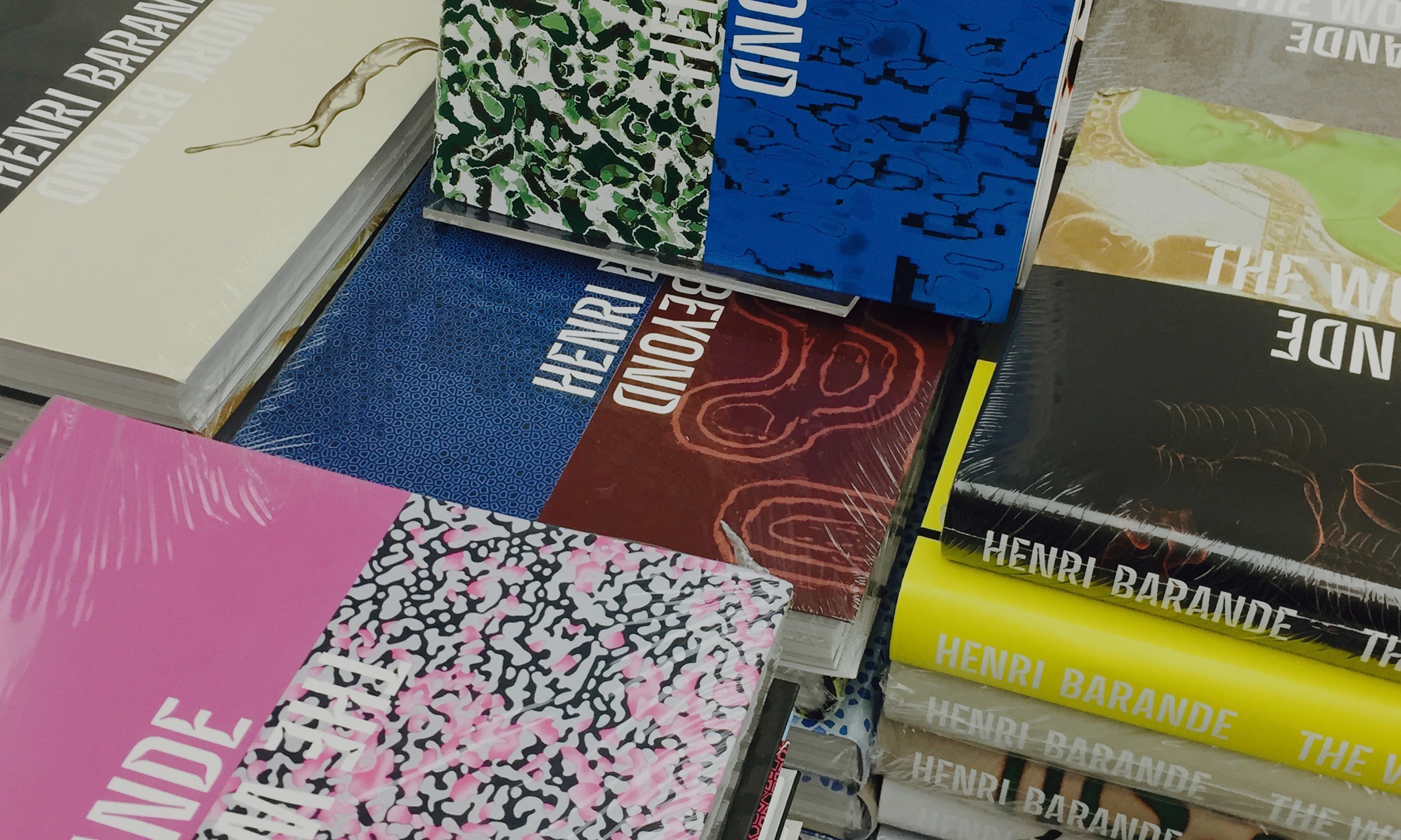
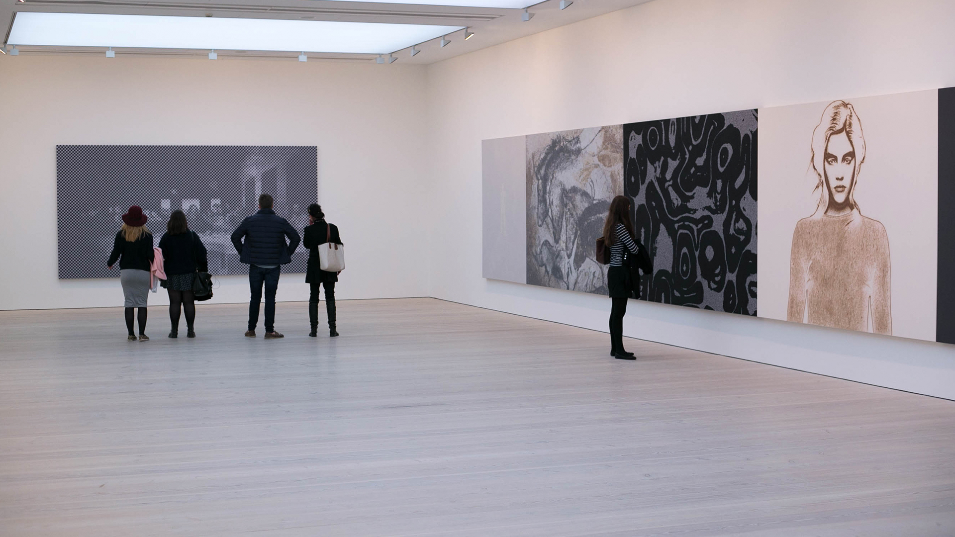
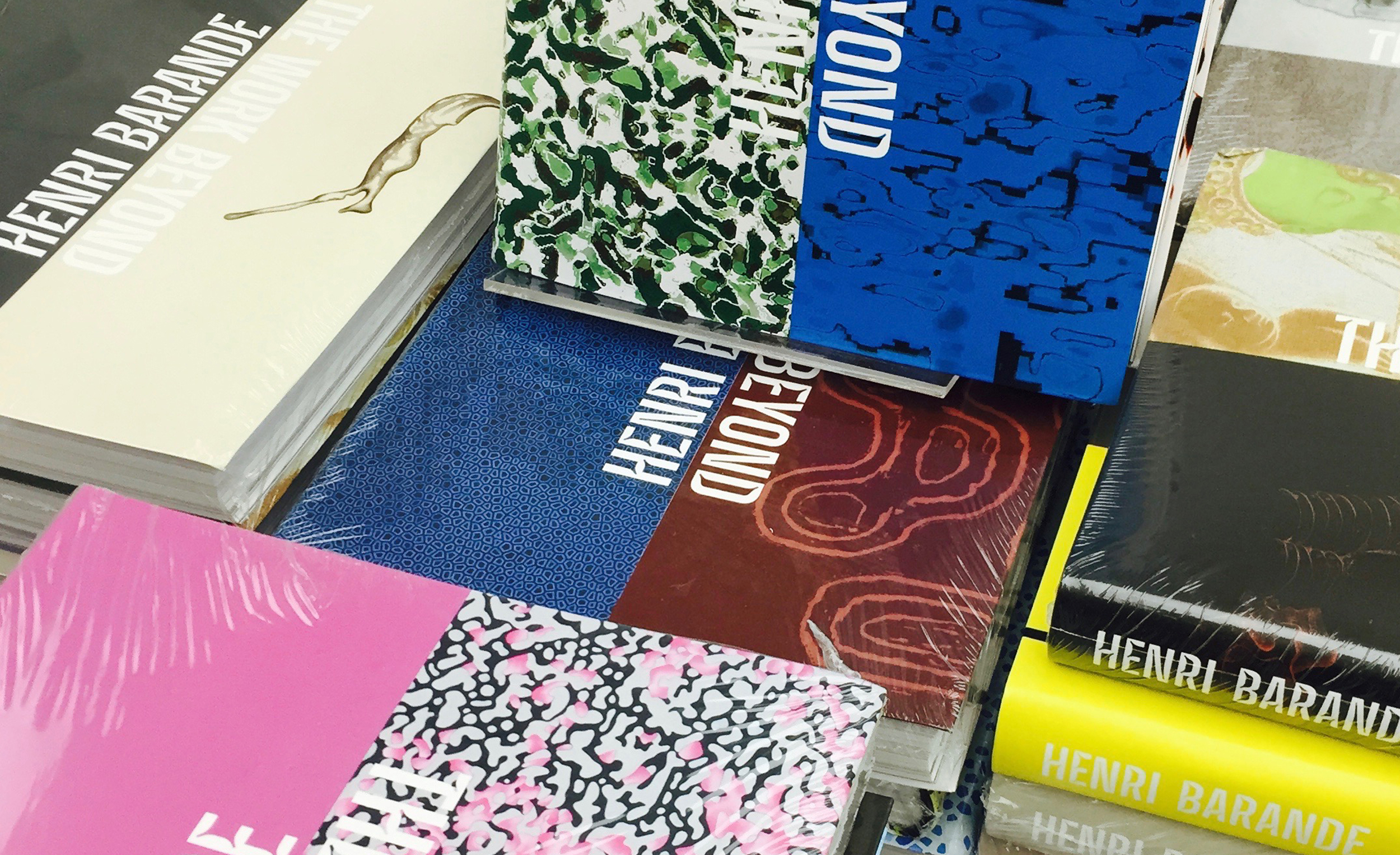
To mark the first UK show of artist Henri Barande Stolberg created a monograph Henri Barande: The Work Beyond with 4,000 different covers published by Booth-Clibborn Editions. The concept for the cover is based on the artists own approach of how to hang his work. When Stolberg met Henri in his Lausanne studio, he noticed the artist’s specific hanging technique, collating various paintings – each around 2m high – into huge collages covering the entire wall. There could be no single, seminal painting that represented his portfolio.
To mark the first UK show of artist Henri Barande Stolberg created a monograph Henri Barande: The Work Beyond with 4,000 different covers. The concept is based on the artists own approach. When Stolberg met Henri in his Lausanne studio, he noticed the artist’s display of his own work, collating various paintings – each around 2m high – into huge collages covering the entire wall. There could be no single, seminal painting that represented his portfolio.
A book design project initially, the concept changed quite quickly to a more challenging project involving typedesign, algorithms and exhibition design. Stolberg asked SchultzSchultz from Frankfurt to join the project.


Together with Schultzschultz from Frankfurt the designers created an algorigthm to randomly combine a series of images one after the other, to mimic the artist’s presentation technique. Over 8,000 cover combinations were produced, from which Stolberg chose 4,000 to be digitally printed.
Together with Schultzschultz from home town Frankfurt the designers created an algorigthm to randomly combine a series of images one after the other, to mimic the artist’s presentation technique. Over 8,000 cover combinations were produced, from which Christoph chose 4,000 to be digitally printed.


A bespoke headline typeface was created, a bold face with acute cuts. A technique normally applied to fonts which are required to enhance legibilty in small print. This was inspired by how Barande plays with resolution and distance in his paintings, to create a dynamic experience for the viewer.
A bespoke headline typeface was created, a bold face with acute cuts. A technique normally applied to fonts which are required to enhance legibilty in small print. This was inspired by how Barande plays with resolution and distance in his paintings, to create a dynamic experience for the viewer.




Selected Works
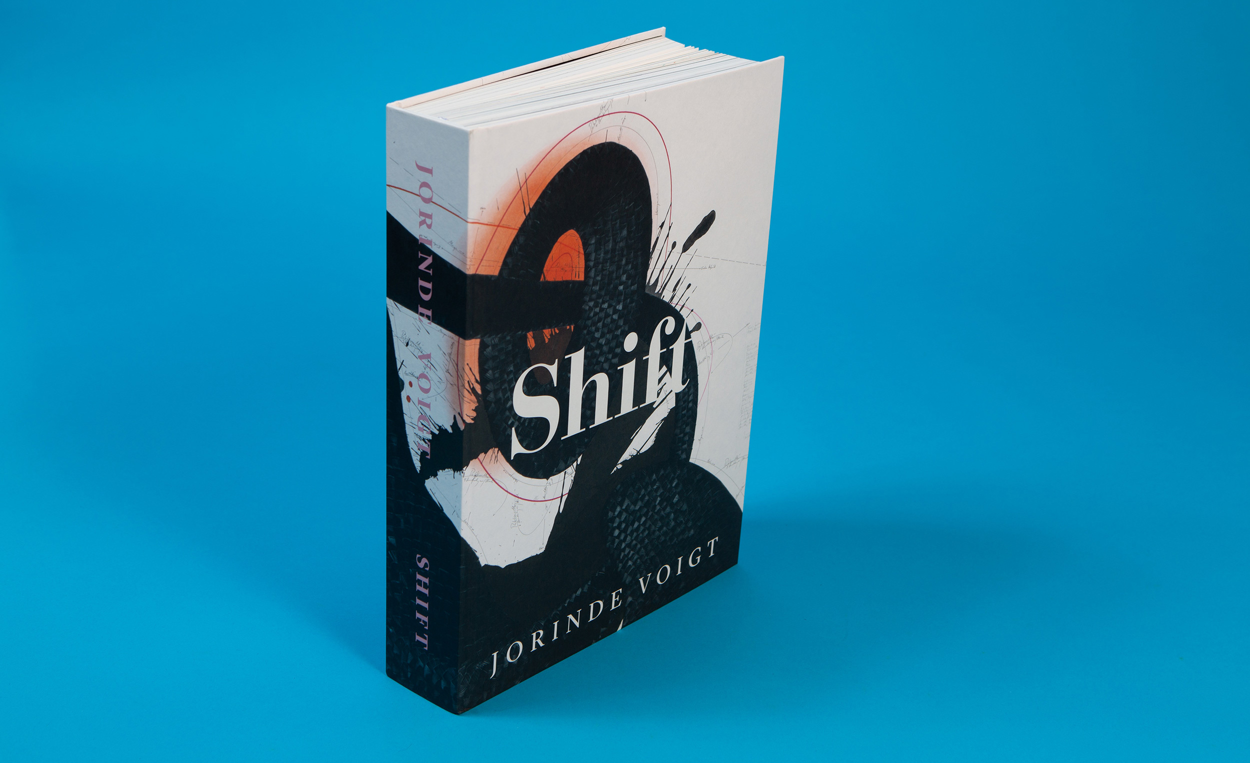
Jorinde Voigt: ShiftBook Design

FourCorporate Design
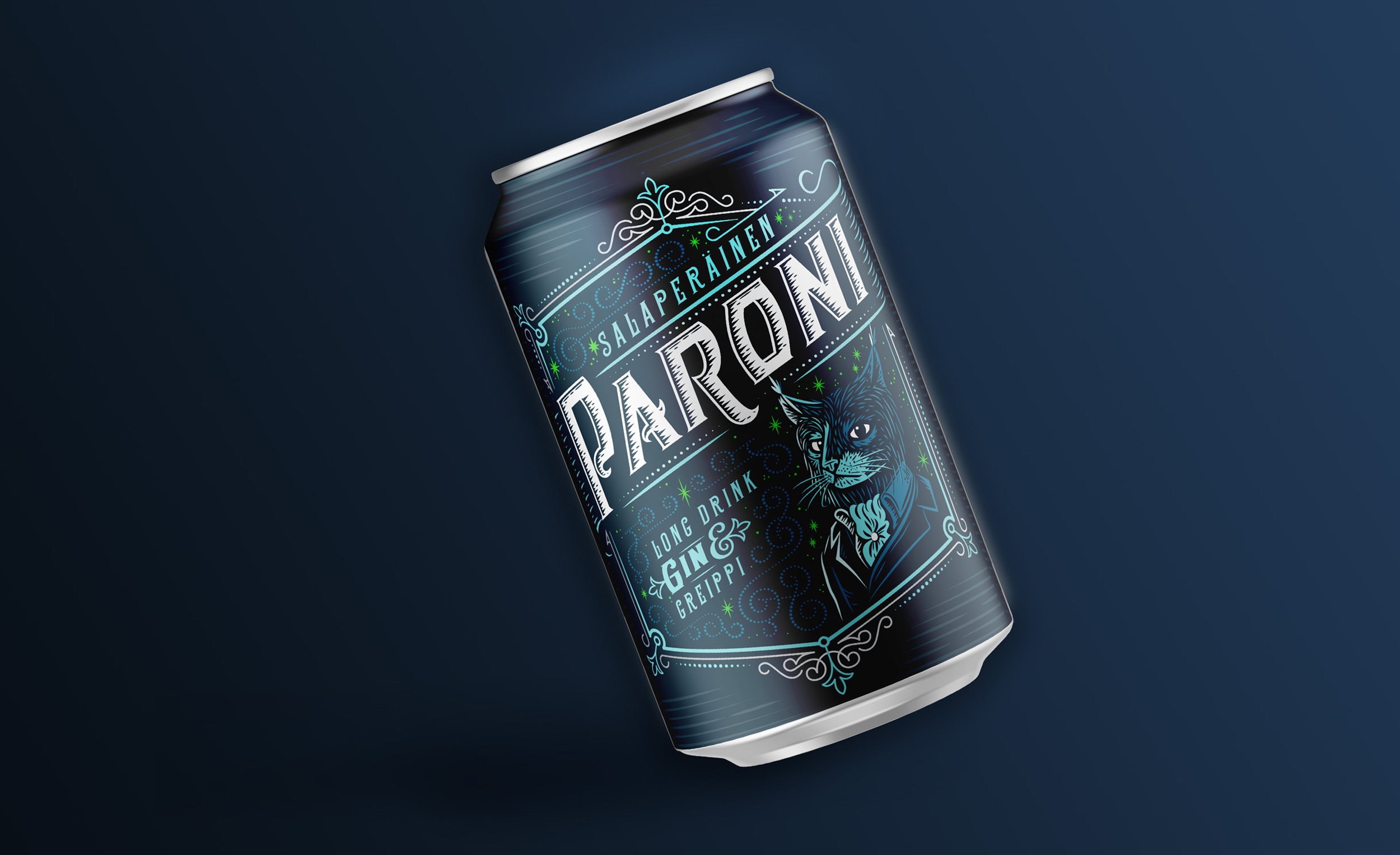
TrokariPackaging Design

HagerCorporate Design

Eyewitness 1917Book Design

Karhu AuthenticityPackaging and Identity Design
BarandeBook Design

HyundaiPositioning
David Nolan – Jonathan MeeseBook Design
Acne PaperEditorial
Dragon RougeBook Design

PaganiCorporate Design
Contact:
mail(at)christophstolberg.com
© All rights reserved 2025 Stolberg Ltd. if not stated otherwise
Contact:
mail(at)christophstolberg.com
© All rights reserved 2025 Stolberg Ltd. if not stated otherwise
Contact:
mail(at)christophstolberg.com
© All rights reserved 2025 Stolberg Ltd. if not stated otherwise
Contact:
mail(at)christophstolberg.com
© All rights reserved 2025 Stolberg Ltd. if not stated otherwise
Contact:
mail(at)christophstolberg.com
© All rights reserved 2025 Stolberg Ltd.
if not stated otherwise